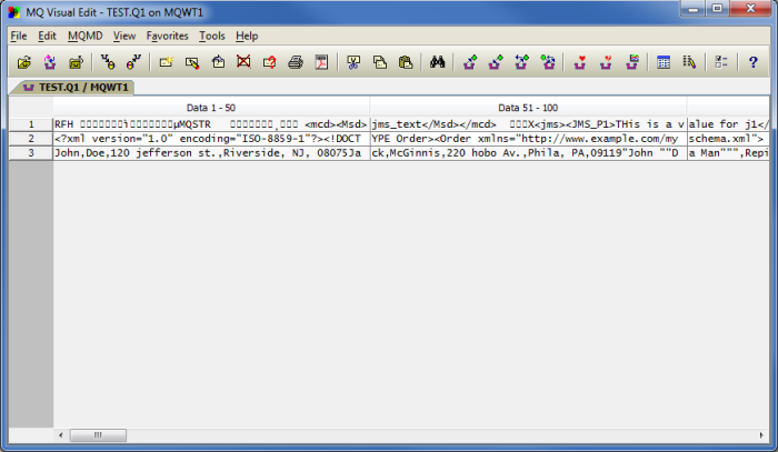
The other day I received an email from a customer who said they preferred the display of MQ Visual Edit V1 rather than how MQ Visual Edit V2 is displayed.
MQ Visual Edit V1 |
MQ Visual Edit V2 |
I designed MQ Visual Edit V2 to provide as much information to the end-user on the main screen as possible. This is what I like but other people have different preferences.
Lucky, when I was designing MQ Visual Edit V2, I figured some end-users may want to disable some of the docks and I even went so far as allowing the end-user to disable all docks.
To disable some or all of the docks on the main window of MQ Visual Edit V2, do the following:

And then click the OK button. MQ Visual Edit V2 will reset itself and the main window will look like the main window in MQ Visual Edit V1.
MQ Visual Edit V2 No docks |
MQ Visual Edit V2 No docks – open queue |
So as Burger King says: Have it your way!
Regards,
Roger Lacroix
Capitalware Inc.